
I mentioned in a previous post about how I should be cataloging my process, if not for pure posterity & narcissism, then at least as a counter to my own spotty memory. I’ve often hesitated to put a lot of this ‘junk’ on my blog, considering starting separate blogs or repositories for such things (on tumblr and whatnot), but especially over the last five years my online presence has become fragmented over half a dozen social networks. It makes sense for all of this — the good, the bad, the junk — to be available together somewhere, and one’s own blog must now be that place. For a more curated, fat-free (and, admittedly, dry) view of my work, there’s always the Portfolio.
With this illustration I made a point of not only being patient with the work itself (a skill I have yet to learn fully that always pays dividends) but to try and catalog the process in as unobtrusive a way as I could. Too much, and I’d spend more time curating than creating. Too little, and I wouldn’t have anything to show but the finished piece.

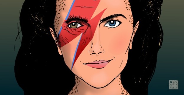
So, Ziggy StarDax, as I took to calling her. I knew that eventually when The Post Atomic Horror Podcast would get around to Star Trek: Deep Space Nine, that I would be doing a supplemental cover featuring Dax. She’s one of my favourite characters in all Trek. Now I just had to make sure I wouldn’t mess it up.

You’ve seen this one before; it was a warm-up sketch from a reference shot of Terry Farrell. Looks nothing like her, of course, but this step is vital to ‘learning’ somebody’s face. The more inaccurate it is, the more you learn about what makes that face unique, identifiable. I’ve probably spoken before about how terrible I am at likenesses, and I can admit that correcting that is one of the goals I’ve set myself this year. A practice sketch like this is vital to that process, and I think I’m firmly on that journey with work like this.
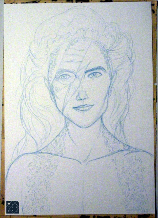
I recently switched to a good blue pencil (a Koh-i-noor Progresso) for my sketches. It means I can keep my pencils, not having to spend time carefully rubbing it away after inks, which tends to bruise the paper (and sometimes mess up the inks), or smear it with grey graphite streaks. The blue can easily be removed on the computer once scanned, and note that it is a much lighter shade in real life; I increased the contrast for presentation here.
This is the most crucial stage for me, the pencils. While I usually have some kind of vague concept to the illustration, by the time the pencils are down most of what defines your image must be set. In this case I wanted to represent the idea that Dax was not just the person we know on the show, Jadzia Dax, but being of a species with a sentient worm passed between hosts, she also had memories & characteristics of the previous people she was. I considered some kind of ‘shattered glass’ image, with each fragment showing a different host, but that would have had slightly negative connotations, and I have always liked how strong the character is. Besides, by this point in the series (Season 2) the only previous host the viewer really knew was the immediate predecessor, Curzon. A ‘half-and-half’ approach was another I considered, but that didn’t really sit well with me.
The Ziggy Stardust image came to me when I was considering having just a swatch of the face being Curzon. It had to contain one of his eyes, of course, and instead of an even slant, the lightning bolt being Curzon tied in well with several themes:
– Star Trek being a space show
– The concept of reinvention & rebirth in a new body
– Dax being a bit of a rock star personality in any body
– And finally as a reference to a real-life astronaut, Chris Hadfield, who had recently been on a cover in similar Ziggy make-up.
When coming up with these covers, humour is always a major consideration, and this solution fit all the criteria.
I’ve taken to instagramming works-in-progress now & then. It’s quick & fun to share things with friends, keeps my energy up. Above is an instagram of me starting to colour, setting up my document with the finished (inked) drawing and my colour & light/shadow references next to them. This is how I start most colour jobs in inkscape. There’s a more detailed account of how I set up my documents here.

And several hours later, I ended up with this. Depicting an accurate likeness is still not my strongest skill, but I think I did okay with this one. I can see a lot of the problems, but hopefully the average viewer won’t. Also, doing magazine cover typography at 5am leads to some irritating minor errors, but you learn to live with it.
Finally, here is an animated GIF of the entire process, from rough sketch to finished cover.

V
