

Here’s a logo I recently did for longtime friend, collaborator & all-round neer-do-well Ron ‘AAlgar’ Watt, in order to unify his many creative activities such as podcasts & humorous cartoon reviews under one identifiable branding roof.
Coming up with a logo to act as an umbrella brand is a unique design challenge. You need to stay true to the existing brands (in this case, the Sarcastic Voyage, Post Atomic Horror & More Bits) while simultaneously keeping the branding open enough that it will fit well next to future, as yet unknown projects.
Since I’d already designed three logos of his podcasts, you’d think that would have given me an advantage, and it did: but only in that I had worked with the client enough over the years to know fairly well what he’d be looking for. But due diligence in the design field means, in some ways, throwing all that you know out the window and starting from scratch, even if the directions you go in don’t end up in the final branding.

Or do they? Here’s a page of idle doodles & sketches from this project. Now, it seems like none of this made it into the final. After all, here are many symbolic or literal representations of an elf holding a spear (a quick online search says “algar” means ‘elf spear’). It was certainly a direction to explore, as a nice strong symbol like a man with a spear has worked hundreds of times for many brands throughout history. It was worth the hours put in, but it also shouldn’t have made it to the final logo in this form, for two reasons:
1) It was not in keeping with the client’s needs & tastes. As a designer you should, whenever possible, look to further that (taste is hard to define but is as much a part of what makes a designer as any technical skill), to move people slightly out of their comfort zone, but not so far that the branding doesn’t feel like ‘them’ to them. AAlgar is a connoisseur of many geeky things, but as far as I know traditional high fantasy is not one of them. None of the podcasts feature elfs, save for the Vulcans in Star Trek featured in Post Atomic Horror. Nor does an elf with a spear scream ‘sketch comedy’ to anyone, even if his eye is being poked out.
And think about it from the perspective of the audience; What would you think if you saw one of the above symbols in the corner of a podcast? Probably not what AAlgar Productions actually offers.
2) It would not be a good graphic. It’s very important to consider where a logo will mostly be seen. In this case, most people will see it in the corner of a podcast cover to Sarcastic Voyage of Post Atomic Horror. In both cases it will sit in close proximity to those logos, and cover art illustrations. Compositional clarity is the issue here; you want something that reads clearly (which the final logo, a clear typographic wordmark, does), but does not compete with either the other logo or the cover artwork for attention. It’s the cherry, not the ice-cream.
As an extreme example, consider this joke logo:
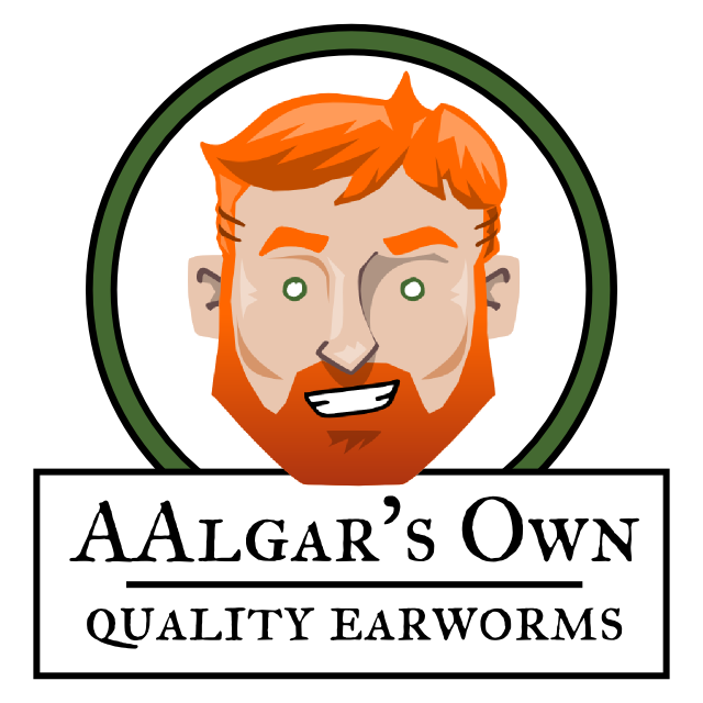
Sure, this would look good on a bottle of dressing. But you can’t put it in the corner of a podcast thumbnail; it would look like garbage, it would detract from the artwork, and you’d never be able to read it at most sizes it’s presented at anyway.
So instead, I went for primarily a readable wordmark, that is styled to convey the double-a in “AAlgar” even at tiny sizes. But a wordmark alone, while perfectly fine for many a brand, is not enough. In a logo I like to build a small ecosystem of symbols and motifs. Even a story, if possible.
![]()
Remember when I said that all that elf spear doodling was not in vain? It’s still here, it’s just in the subtle triangle that sits above the AA. Sure, only I know about it (and now you do), but it adds a certain layer to the logo without screaming it. Also, one of the motifs of the Post Atomic Horror logo was atoms and orbits and space ships, which I brought back here as the two triangles—as abstract a spaceship as possible—and the circle is their orbit. And finally, since AAlgar productions is (for now at least) primarily involved in the creation of audio-based entertainment, the circle with it’s ‘play’ button also symbolises a tape reel or loop of audio.
So, this seemingly simple logo contains a spear, an atomic orbit, two space ships, and an audio reel. Is some of this bullshit that no person seeing it is ever going to notice or care about? Sure. But it’s all there if you want it. And it reads well on a page. And its elements help tie all the sub-brands together.
Job done, I’d say.
V