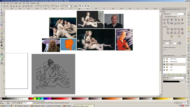
A clean & organised work area is important even with virtual spaces. Everyone arrives at their own system they’re comfortable with, but my inkscape documents tend to work like this:
- Everything immediately to the right of the page definition is the actual ‘work’ area.
- Everything to the upper-right of page is reference images, colour keys, or imported graphics such as logos for inclusion in the image.
- (Not seen here yet) Everything to the left of the image is a finished draft of the final design/illustration. Iterations shift to the left when new ones are created, tangents stack directly below the originating iteration.
- Final presented work falls within the page area, and directly below it if multiple export shapes are needed (podcast covers usually have a square version derived from the elements of the ‘magazine’ page version). Sometimes I may make an alt-version of the file if, for instance, the artwork is created using a sketch with a multiply layer effect, with the colour vectors on the layer below. Saves me having to move it & align it properly later.
- Top-left usually either contains nothing, or discarded bits & bobs, usually masking shapes that may need reusing later, etc. They’re always offset by some logical number like -1000px and so on, so I can quickly move them back into place through numerical X/Y co-ordinate input alone
- I set-up most things on separate layers (references, high-res versions of sketches) to be able to make them disappear when needed. Lowest layer is always just 50% grey boxes added as needed below artwork. The neutral value helps when picking colours for illustrations; a white background is too contrasty & fatigues the eyes. If there’s a lot of elements artwork, I’ll just dispense with this and make the document itself 50% grey
V


