Every New Year since I was 12 I think to myself, “You should really learn to draw.” And at the end of every year I find that I have drawn less than the previous year. My problem is twofold: while I have ample access to teaching material on drawing and have dipped in and out of it frequently, I have never developed a knack for daily practice. Secondly, when I do practice I try to draw everything I imagine I would like to draw, and within a few minutes a lack of experience and skill leads me to be frustrated with the terrible doodles on the page which look nothing like the grand illustrations I imagine.
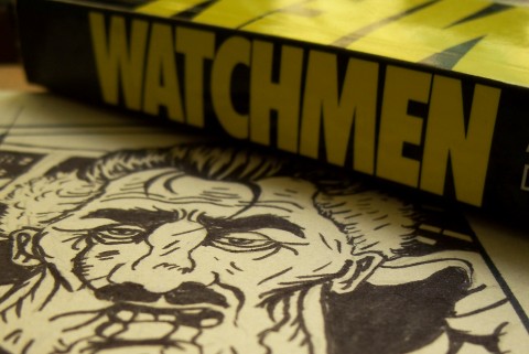
So this year I thought I’d just try to redraw the greatest graphic novel of our times: Watchmen.
Origin Story
One day a few years ago I was re-reading Alan Moore and Dave Gibbons’ classic for the umpteenth time, and was struck by the quality of the drawing, the writing — just everything, really. I wondered when — or if! — I’d ever develop skills good enough to make comics even a fraction as good. As I pored over each page a memory flooded back: me hunched over a table — I must have been nine — copying a money shot of Kilowog smashing into the big villain from the Green Lantern: Emerald Dawn TPB. It was the first time I’d attempted something like that, it wasn’t exactly great, but it was a fairly accurate facsimile of the original. I noted with some disappointment that in the sixteen years since my drawing skills had probably deteriorated, not improved.
An idea struck: why didn’t I just try to redraw Watchmen? It was basically what most kids do, learn to draw by copying from their favourite comics, but I’d take it to the next level by trying to reproduce the entire book. Every page, every panel, every word balloon and every title, teaching myself — if not classical draftsmanship — then at least the workings and pitfalls of making an actual superhero comic. I put the idea out of my mind for a while, but this year I dusted off my copy and set to work in my free time.
Rough Draft
 There are several reasons I chose Watchmen over other comics. Firstly, I like it a lot, and was going to re-read it before the movie comes out anyway. Secondly, it’s set up on a strict grid, which not only appeals to the graphic designer in me, but also makes my life a lot easier as far as reproducing pages is concerned. Thirdly, it’s a dense script as most Alan Moore ones are, and since I was going to be doing the word balloons too (an Alex Toth doctrine from that infamous Steve Rude critique), it would really teach me something about getting words into a panel.
Finally,it’s not drawn in a highly stylised way. If I’d chosen works by other artists I admire like Darwyn Cooke or Terry Dodson, I’d have to look past their styles in order to interpret their work, or worse, I’d end up mimicking their styles too much and not really learning. Dave Gibbons’ work in Watchmen is almost photographic; it’s still drawn like a comic, but the proportions are realistic and everything is done with such attention to detail that there’s a lot of room for interpretation.
And interpreting it I would be; I didn’t want to just copy it or try to trace DG’s work line for line.
Breakdowns

As of today I’ve finished my first inked page, and that’s because I’ve been having some teething troubles. I’m much, much slower at drawing that I have any right to be. A single inked panel takes me around 90 minutes, and that’s about as much time as I can set aside for a side project like this. I can grumble endlessly about how frakking detailed Dave Gibbons’ work is and how he must be a Terminator/Cylon, but the plain truth is my hands are stubs that don’t know what to do.
Of course, this exercise is designed to remedy just that (I hope), so I’m not worried.
Then, of course, I’m a tightwad, so I wasn’t going to waste art paper for something like this. My first pages were done on ‘computer paper’ — office drones from Accounts will know these as wide, perforated white-on-one-side sheets. Fold them in half and you get a two comic-book-sized pages ready for Japanese fold binding. Perfect, right?
Except they’re terrible to draw detail on. Maybe Archie comics would be okay, but certainly not Watchmen. Also, when I say comic-sized pages, I mean actual printed comic size pages. Most artwork that goes into comics is done at larger sizes and shrunk down.
Despite knowing that, I thought I’d try anyway, and the first two pages were done on the bad paper at that size. I couldn’t ink them — I gave up even trying to do the word balloons after two panels because it was too small. Until now I’ve always drawn small; tiny notebooks, tiny sketches. I shudder at the sight of blank A4 papers, not knowing what to do.
But this project couldn’t continue at that size, so I dragged out a roll of cheap sketch paper (I think you still get it at IKEA in the kids section, for about $4) and cut out foot-wide sheets. This gave me the required 10 by 15 inch frame I needed, and immediately I could tell the difference. The paper is still nowhere as good as art stock, but it’ll do.
For actually drawing the thing, I’m primarily using 2B mechanical pencils. I’m comfortable with them and I hate sharpening/going at ’em with a knife. Inks are first laid down with a Japanese brush pen (double-ended, small and medium tips), which gives the whole thing a certain manga-esque ‘bounce’. The lines are a bit more slack and curvy than Dave Gibbons (did he use 0.1 Rotring engineering drawing pens or something?) and this is partially down to my more cartoony style as well. I tackle the word balloons and text first with a fine-liner, then do figures from foreground to background.
So as not to dull the brush pen, I fill in the blacks with a couple of sizes of markers. I don’t erase the underlying pencils, mostly because this project isn’t going anywhere beyond this so I don’t need to, and also because the paper is too thin to stand it and I’ll ruin whatever is there. Also, it’s nice seeing your construction lines now and then.
Finishes

For now I’ve finished just one page (the first two and cover don’t count since they were on the smaller paper) and at this rate I’ll probably finish this in around 3.2 years (I did the math). I’m enjoying it immensely, but I don’t want it to consume my life. So I’ve decided that for every page of Watchmen I do, I should then do a finished original illustration. I don’t want to just redraw comics for the rest of my life, I want to make some of my own!
Even at this early stage I’ve learned so much. It may be trivial knowledge for most artists, but it’s gold for me, and the only way I would have learnt it is the way I’m doing it.
I won’t be putting up all the pages online for public viewing, so please don’t ask. I won’t give away or sell any of these drawings either. The line between fan-art and copyright infringement is a thin one, and a redraw of a 400 page graphic novel somebody else created is not something I want to put up. If you haven’t read Watchmen please go out and buy or order a copy. Trust me, you won’t regret it.
I will update every month or so with my progress and musings on the work as I go along. I hope you’ll drop by now and then and tell me how it’s going.
V

 There are several reasons I chose Watchmen over other comics. Firstly, I like it a lot, and was going to re-read it before the movie comes out anyway. Secondly, it’s set up on a strict grid, which not only appeals to the graphic designer in me, but also makes my life a lot easier as far as reproducing pages is concerned. Thirdly, it’s a dense script as most Alan Moore ones are, and since I was going to be doing the word balloons too (an Alex Toth doctrine from that infamous Steve Rude critique), it would really teach me something about getting words into a panel.

